|
Welcome to my online column. It's a few notes on what happens on different photo shoots and thoughts about shooting and image processing that may be useful to you if you're looking for my services as a photographic artist, or if you're a fellow shooter/image maker who works in the same areas in which I do. Contesting ContestsSo I entered another photo contest. Okay, okay, those of you who've heard me rail about contests hold off on the mouse click – this one was a good one. No, I didn't win. I didn't even place or get a mention – I don't care because I shouldn't have. Here's my entry:
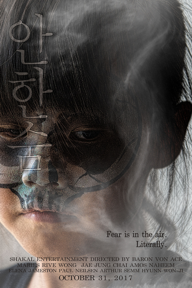
The contest was to create a fictitious horror movie poster. It's an acceptable work (at least in my biased opinion), but I am glad it didn't fare better in the competition. Let me explain.
Rewind several years. I've never been big on photo contests, but I've entered them, primarily to stretch myself. One thing you learn is that judging may seem arbitrary, or it may be very balanced and impartial, the latter primarily with trained competition judges. The former are the ones I've come to avoid, but now and again, I still succumb and try anyway, hence this rant.
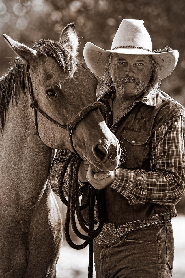
It's not always a surprise when contest placings don't make sense. Looking at the results of a local, small community contest at a fair (I didn't enter this one), there were a lot of amateur cliché snapshots along with some wonderful portraits and interactive scenics with dramatic lighting. The winner? A cliché sunflower snap, ironically hanging right next to a far-better shot with dynamic composition that showed a working rancher backlit through haze. Not only didn't it even get an honorable mention, it was likely best of show (IMO). Amateur judges = amateur placings, so no surprise here. But, in other contests, the judges are supposed to know better.
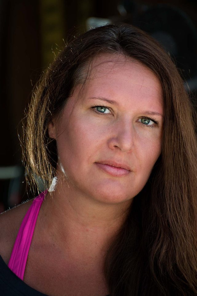
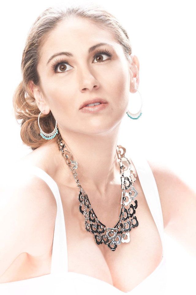
A few years ago, I entered this shot into a portrait contest sponsored by a major photo magazine:
It didn't win, place or mention. As the contest unfolded online, they showed all the entries and there were far better portraits, so I knew I was appropriately out of the running. But, then they posted the winner, and that ticked me off – it was a slightly glorified snapshot not even close to many, many way better images. Even my entry was better. I'm not sure what tainted the pool, but I no longer subscribe to the magazine.
Earlier this year, I entered this shot in an informal contest promoted by a prominent photo art vlogger who would judge. No prizes or anything – he just shows and discusses the ones he likes in his video blog. The contest challenge was to do something that illustrates the color "red."
This I upped for myself with this thinking: Most people will lean on the color, so can I illustrate the concept of "red" without using the color itself? My able assistant Headly posed for me as I juxtaposed the former Soviet Union flag over him, the concept being to characterize the bleak, dark impersonal nature of the Soviet system. The well-known flag would make "red" obvious even with the color itself missing.
Or not. As I watched the vlog with the posted results (which excluded mine, of course), every shot had the actual color red, with some (to my eyes) cliché and not particularly noteworthy. But, the vlogger's a heavyweight voice in the photo art community, so I'm not knocking this. What do I know about that world? Not much. So, I realized that my photography differs significantly, making my shot a big mismatch – or maybe it just doesn't work at all – so my bad either way. I no longer follow his vlog – not out of anger, but because it doesn't pertain much to what I do.
This brings us to the movie poster contest by phlearn.com. My entry didn't place or mention, but that's fine: 1. IMO, my poster isn't bad. I'm satisfied with it, but it's more of a thriller movie poster than a horror movie poster. (The title is, loosely, "Don't Breathe" in Korean, btw). 2. There were many, many entrants that fit "horror" better. 3. All the winners and mentions were excellent work. The judges chose well (click the link to see them) and while anyone can debate the rankings, I don't think anyone can say a clearly inferior work ranked inappropriately.
So, thank you, Phlearn, for a contest I don't contest, protest or detest.
Action Hero in Action
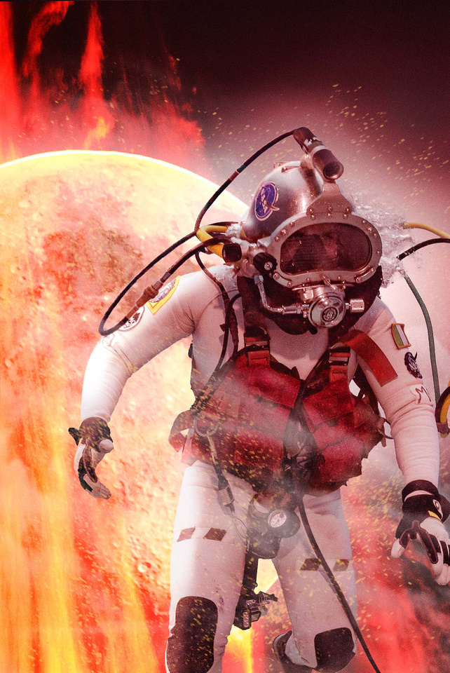
As Dr. Marc O'Griofa, an aquanaut in the 2016 NEEMO 21 mission, conducted science on the seafloor, a frame I captured just screamed movie-style action hero poster to me. This wasn't something I'd been asked for as part of my mission support duties, but sometimes you get inspired and you just have to run with it.
We all know action hero posters when we see them -- like the Dark Knight, Ironman or Lara Croft. In fact, in almost any culture and even in a language you don't speak, you still know action hero posters. Even posters for movies that have action and heros, but aren't really "action hero" movies have the look -- like Gravity. So, what is this look that makes action hero posters obviously action hero posters? There are at least ten characteristics common in action hero posters. Master Photoshop artist Dom Quichotte identified eight in his FXray Superhero tutorial (with some of my elaboration): 1. The hero holds a weapon or a technical tool 2. Smoke, fog or clouds 3. Flying debris 4. Sparks 5. Edge lighting on the hero 6. Dark buildings or other dark structure in the background and/or foreground 7. Rain 8. Fire or explosion The last two, which Quichotte didn't mention (but are in his tutorial image) are: 9. Specialized clothing (e.g., superhero costume, technical/functional wear or other distinct wardrobe) 10. Hero either in action, giving defiant expression, or both
Most action hero posters don't have all of these, but they do have most of them, with defiance and/or action the one that seems universal. Click some of the links above: The Dark Knight has all but rain and holding something. Ironman has all but the buildings and the rain. Lara Croft is on the low side, but still has the weapon, edge light, specialized clothing and defiance, plus you could argue whether the ornate 3-D logo qualifies as dark structure, and the texture is similar to smoke. Gravity has more than Lara Croft: smoke, flying debris, edge lighting, dark foreground structure, explosion, specialized clothing and hero in action.
And that brings us to our action hero, Doctor Marc. No weapon or tool in hand (though clipped to his harness), but smoke and fog, sparks, edge lighting, fire, specialized clothing and he's clearly in action. Although I didn't manage the dark buildings, putting the moon behind him seemed a better fit anyway, considering he was doing research that will help us explore space. Although I did this just to stretch my creative legs, my action hero poster seemed well received by the NEEMO gang, and Marc seemed to get a kick out of it.
The real movie posters are, admittedly, better and more detailed, plus have the glamour, talent and stunning looks of Christian Bale, Robert Downey Jr., Angelina Jolie and Sandra Bullock. But, even with all that, my action hero poster has them all beat because it has the one thing they all lack (though Marc would try to deny it):
Two For OneWhile providing diver support and shooting for the NASA NEEMO XXII mission a couple weeks ago, my friend Dawn asked if I could spare a few moments to do a new portrait of her. Having shot her before and always glad I did (she's our generation's Maud Adams, Bond girl of the 1970s -- click here and you'll see what I mean. Dawn crewed NEEMO XXI so that's Dr. Dawn to you. ), I jumped at the chance. The camera loves her (even facing away -- check this out), so I wasn't going to let the opportunity to slip by.
But, there was a challenge. While I've recently been shooting a lot to help with NEEMO press coverage and in-house imagery, the majority of the work's underwater and I'm hauling dive gear, so I didn't have a lot of surface-side gear that I normally use for portraits on location. I didn't even get to bring Headly. But, being a pro shooter isn't about having everything you'd like to have at the moment you'd like to have it -- it's about knowing light then using what you've got to get the job done.
During a break in my duties, my solution (as it always is in these cases) was to find the light I needed and augment it with what I had (two speedlights). I kicked around the support facilities for FIU's Aquarius Reef Base, finally landing on some nice indirect sun just inside the door of a tool shed. But, before pulling Dawn away from what she was doing, I wanted some test shots. My friend Jason was wandering by and "volunteered" (minor arm twisting) to fill in for Headly. Although I hadn't set out to portrait Jason, even as we worked I knew I had something. After some light adjustments and post processing, we got this:
Wrapping from channeling Maverick and Top Gun, I called in Dawn. Since both sessions were going to be in the same basic light and setting, my wheels were already turning on how to make them differ. To start, their individual features lent themselves to different positions. Then, I adjusted the lights a bit, changed my angle and we started shooting We ended up with this, among others:
The final touches were in post. Jason's shot lent itself to stylized black and white with a gritty, heavy-detail look that works well on guys. Normally, I have people pull their shades so we can see emotion in their eyes, but the aviators make this shot. He looks like a man-of-action, which fits. Jason has a big heart that he backs with action.
Dawn's more likely to be smiling than not, and we while have some of her lights-the-room smiles, I love the intensity her serious-side projects in this one. It reminds you not to stumble over her beauty and overlook that she's one of the world's leading space/underwater scientists. Finishing her image was the classic handling fitting of a lady (as well as a chance to do better; I was way heavy-handed with my last portrait of her). The result is something I like, but, I don't think I'll compare her to Maud Adams any more.
It's not fair to Maud Adams.
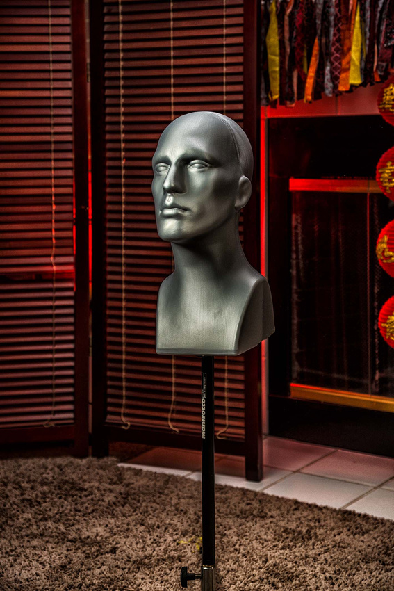
My Head Assistant
A few years ago, I wrote Praise for Photo Assistants, lauding the accomplishments of Niccole, Dawn, Aaron and others who make a shoot go better -- smoother, faster and generally more efficient. Working solo's often the only option, but I avoid it when possible. So, you'll appreciate that I've brought another assistant onto my team. This is he, and his name is Headly. It only took him one shoot to earn his place as my head assistant.
Headly came on board at the suggestion of noted portrait and lighting master Tony Corbell in one of his YouTube presentations, even though in practice, Headly doesn't actually do much. He never whispers cool ideas to me, and so far, he refuses to set up gear. His people skills are a mixed bag: he's a great listener, but he doesn't say much. And, if a client wants coffee or a soft drink, forget asking Headly -- he won't budge.
But, that's also what makes Headly my head assistant. He's the perfect stand-in for lighting. He stays exactly where I put him, and nothing distracts him from the position I need to get the hairlight just right or whatever. He may not set stuff up, fetch or talk, but he frees the rest of the team from stand-in duty, never complaining, even when he has to stand like a statue for hours. Apart from actual shoots, I can always count on Headly to be available when I want to try out new kit or lighting ideas. And, it's no accident that I chose him over other prospective assistants of his type for his gray skin –- again recommended by Corbell. Gray, as opposed to a normal skin color, lets me objectively assess the tonal values I'm getting as I light.
Best of all, if Headly wants a raise, I just adjust his lightstand higher.
Okay, by now you get the point, so enough tongue-in-cheek and I'll quit while I'm ahead. Well, while he's a head.
Run With It
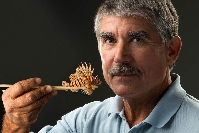
Hopefully you agree the finished image tells the story, but as I said, I was beating my head against a wall trying to come up with an idea. As it happened, though, the day before I was photographing Leslie Leaney's portrait for his Reaching Out Award (there are two annually). Founder of the Historical Diving Society (hence the award), Leslie is a warm, charming man with a quick sense of humor. We were on the way to make his portrait and I mentioned we were doing Lad's the next day.
"Ha, you should shoot him holding a lionfish with chopsticks," Leslie teased. He meant it as a joke, but it stopped me in my tracks.
"Hey, that could work!" I said. I shared the suggestion with Dawn Azua, the award ceremony director. She thought it workable and in the middle of everything else, came up with chopsticks and a model lionfish overnight.
As you can see, it did. At the award ceremony, Lad thanked Leslie for the idea (I'd shared the story with him when we shot) and complimented the work, so apparently he liked it.
The lesson is that sometimes someone gets an idea that on the surface, you wouldn't take seriously -- unless you stop to look at it. So, don't dismiss silly, wacky or crazy proposals until you've weighed their merit with a serious eye.
BTW, thanks Leslie, for the idea, and thanks, Lad, for not being afraid to run with it.
What Really Matters . . . Is Possible
Huge, world-wide problems loom over us. They're intimidating and daunting, sometimes seeming insurmountable. Sometimes people wonder whether it's worth even trying to take them on. The answer is "yes," every time, even though some issues remain with us year after year, generation after generation: war, poverty, slavery, human trafficking. But given enough time and effort backed by conviction and faith, God empowers us to topple these global giants.
A few years ago I wrote this blog post about the world's orphan problem, and in it, I shared statistics that if about one in nine families adopted one child globally, we could close every orphanage, showing that this should be a solvable problem. We shouldn't need any orphanages. It's not that orphanages are bad -- they are way better than parentless children on the street or worse, in the hands of human trafficking -- but they aren't good. Children raised in orphanages typically have developmental delays and emotional problems that follow them through life, and it's worse in economically depressed countries. In fact, it is thought by many that poverty is the primary force driving the need for orphanages rather than the existence of suitable family homes. Regardless of why we still have orphanages, though, there's no debate that where children should be is with a family.
Rwanda is the first country putting this to the test, which is remarkable considering that the nation has widespread (but improving) poverty and is still recovering from its 1994 genocide uprising. Yet, backed by the UN, donors like UNICEF, and international Christian leadership, in 2012 the Rwandan government set out to place every institutionalized orphan in a foster or adoptive home. And, it's working. In 2012, the nation had more than 30 orphanages; today it has three. This has happened through subsidizing, awareness, an effort to locate families and international adoption. When (not if) Rwanda closes these three, it will be the first country to do so -- proving that we can put the age of orphanages behind us. If Rwanda can do it, I see no excuse for more economically advantaged nations not to.
To be fair, the movement in Rwanda hasn't been without problems or critics. Nothing humans do is perfect; there are mistakes to learn from and challenges to surmount. Nor can anyone break away from the status quo without someone lobbing tomatoes. But, Rwanda has stepped out in strength and in faith to do something that ought to be done, and it is doing it.
Adoption changes lives, and hopefully, you can see this in this shot of my wife and daughter. You get more than you give by adopting. If you're thinking of growing your family, please seriously consider adoption. And, if you wonder whether adopting a child really makes a difference against this global giant of a problem, please consider this:
David took down Goliath with one stone.
Altitude Attitude
One challenge in professional imaging is making your shots look like they're supposed to look. You can say "well, duh," (and indeed you should), but sometimes there's more to this than meets the eye -- and camera. What sometimes gets lost is that it's not where you shoot, but how it looks that counts.
A studio makes this simple, but you can only do so much there, so for much of my work involving diving, we go on location to popular scuba destinations. But, what if the shot needs a setting that we can't get to due to time, budget and/or logistics? Hollywood solves this dilemma routinely (they didn't shoot The Martian on Mars), but Hollywood budgets are a smidgen larger than those I get to work with.
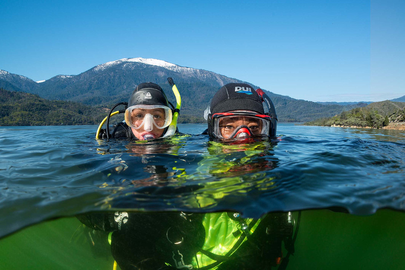
Last spring, we had to shoot altitude diving, which by definition takes place 300 metres/1000 feet or higher above sea level, typically in mountain settings. We faced two dilemmas: One, the last time we did this, we went to altitude dive sites, but most of the images looked no different from sea level. Two, California was coming out a cold winter with lots of snow (finally!), meaning all the altitude sites reachable within our schedule and budget were frozen over. It appeared we were up the proverbial creek, until we borrowed a page from The Martian. Could we find a place that looked like altitude diving that would work?
Disregarding elevation, we searched for a lake surrounded by the snow-capped mountains and pristine shorelines one associates with altitude diving -- and ding! Whiskeytown Lake. I doubt I'd have stumbled onto it 15 years ago, before iOS Maps, Google and You Tube, but that was then and this is now. We had what we needed. Our producer contacted the National Park Service for shooting permits (they were awesome, BTW), and we hit the road for Redding, California (close to the lake). We scouted sites for half a day, shot for two, and got some wonderful images, including this one (also made the cover of The Undersea Journal).
So, by adjusting our attitude about altitude, we came home happy campers with not just what we needed, but what we wanted, on schedule and on budget.
PS: For any purists who want to argue that altitude diving imagery should only be created at altitude, at about 365 metres/1200 feet above sea level, Whiskeytown Lake is technically an altitude dive. Oh, and BTW, Wadi Rum, Jordon, where they shot The Martian, is not technically part of Mars.
Light Meters Are Stupid – And Invaluable
After years of using light meters, here's what I've learned: 1. Light meters are stupid. They have absolutely no idea what the correct exposure is. 2. Light meters in the camera are even stupider and have even less idea what the correct exposure is. 3. But, I hate working without them.
When I was shooting all three of these images, the correct exposure was very different from what my light meter said. Based on it, the first image is over exposed (high key), the second is under exposed (light supplemented) and the third is over in some places and under in others (back lit with fully blocked foreground shadows).
Actually, all three are correctly exposed. Correct exposure is not an objective value. It is an artistic value based on what you're trying to accomplish in the image. So why use a light meter? Because used correctly, a light meter gives you something useful: the exposure that yields neutral gray in a given light. Unless I can't for some reason, I measure the light falling on the subject (incident metering) rather than bouncing off (reflected metering) because colors and tones alter reflected light (meters in cameras always read reflected light, btw), making it harder to determine the objective, neutral gray value. It's my job to decide what tonal value I want the final image to show, not the meter's. The meter gets me there faster by giving me a known start point. Once I know the tonal values in a setting, I set my camera (on manual) to the exposure I decide is correct, and I'm usually there with only a couple test shots and adjustments.
Yes, I know your iPhone gives you good exposures. Camera designers have gotten really good at creating light meter systems that give snapshooters good automated results in average situations most of the time. But, even with advances in the technology, these systems still struggle in many lighting conditions that, ironically, are some of the best conditions for dramatic shots. Many strong shooters use auto exposure, but no serious photographer blindly trusts automation without paying attention to what it's doing and overriding it when appropriate.
So, of course light meters are stupid. They have no brain and they have no heart. But, they're fabulous tools that your brain and heart can use when you shoot.
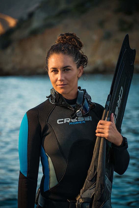
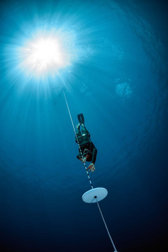
Photoing Freedivers
Want to model underwater? Cool, let's do a shoot where you have to hold your breath (no scuba), then swim to 50 feet (with perfect freediving form), without rushing (because I need time to compose and shoot), then leisurely return to the surface like you do it every day.
Doesn't sound easy, does it? That's why it was a joy shooting champion freediver Liz Parkinson, who does do this every day — well, practically every day. If you know anything about modern freediving, no, 50 feet isn't that deep for a moderately experienced freediver. Admittedly, for Liz, it's a milk run . . . uh, well, it would have been, except I had her to do it again and again. And again. And one more time. Make it two, but we need to go 20 feet deeper. . .
To her credit, Liz freedived dozens of times over a week for stills and video last August, with near perfect technique for every skill we needed to image, staying exactly in the light we needed her in. She made it look easy, without one complaint. When she wasn't diving for camera, she was coordinating the other models, paying attention to safety issues, wrangling sharks . . . well, it's a long list.
This frame is a popular favorite — and hey, we made the cover. So, thanks, Liz — and everyone else who modeled on that shoot.
|