Contesting Contests

So I entered another photo contest. Okay, okay, those of you who've heard me rail about contests hold off on the mouse click – this one was a good one. No, I didn't win. I didn't even place or get a mention – I don't care because I shouldn't have. Here's my entry:
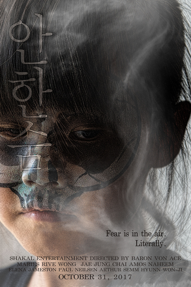

The contest was to create a fictitious horror movie poster. It's an acceptable work (at least in my biased opinion), but I am glad it didn't fare better in the competition. Let me explain.
Rewind several years. I've never been big on photo contests, but I've entered them, primarily to stretch myself. One thing you learn is that judging may seem arbitrary, or it may be very balanced and impartial, the latter primarily with trained competition judges. The former are the ones I've come to avoid, but now and again, I still succumb and try anyway, hence this rant.
It's not always a surprise when contest placings don't make sense. Looking at the results of a local, small community contest at a fair (I didn't enter this one), there were a lot of amateur cliché snapshots along with some wonderful portraits and interactive scenics with dramatic lighting. The winner? A cliché sunflower snap, ironically hanging right next to a far-better shot with dynamic composition that showed a working rancher backlit through haze. Not only didn't it even get an honorable mention, it was likely best of show (IMO). Amateur judges = amateur placings, so no surprise here. But, in other contests, the judges are supposed to know better.
A few years ago, I entered this shot into a portrait contest sponsored by a major photo magazine:

It didn't win, place or mention. As the contest unfolded online, they showed all the entries and there were far better portraits, so I knew I was appropriately out of the running. But, then they posted the winner, and that ticked me off – it was a slightly glorified snapshot not even close to many, many way better images. Even my entry was better. I'm not sure what tainted the pool, but I no longer subscribe to the magazine.
Earlier this year, I entered this shot in an informal contest promoted by a prominent photo art vlogger who would judge. No prizes or anything – he just shows and discusses the ones he likes in his video blog. The contest challenge was to do something that illustrates the color "red."

This I upped for myself with this thinking: Most people will lean on the color, so can I illustrate the concept of "red" without using the color itself? My able assistant Headly posed for me as I juxtaposed the former Soviet Union flag over him, the concept being to characterize the bleak, dark impersonal nature of the Soviet system. The well-known flag would make "red" obvious even with the color itself missing.
Or not. As I watched the vlog with the posted results (which excluded mine, of course), every shot had the actual color red, with some (to my eyes) cliché and not particularly noteworthy. But, the vlogger's a heavyweight voice in the photo art community, so I'm not knocking this. What do I know about that world? Not much. So, I realized that my photography differs significantly, making my shot a big mismatch – or maybe it just doesn't work at all – so my bad either way. I no longer follow his vlog – not out of anger, but because it doesn't pertain much to what I do.
This brings us to the movie poster contest by phlearn.com. My entry didn't place or mention, but that's fine:
1. IMO, my poster isn't bad. I'm satisfied with it, but it's more of a thriller movie poster than a horror movie poster. (The title is, loosely, "Don't Breathe" in Korean, btw).
2. There were many, many entrants that fit "horror" better.
3. All the winners and mentions were excellent work. The judges chose well (click the link to see them) and while anyone can debate the rankings, I don't think anyone can say a clearly inferior work ranked inappropriately.
So, thank you, Phlearn, for a contest I don't contest, protest or detest.