|
Welcome to my online column. It's a few notes on what happens on different photo shoots and thoughts about shooting and image processing that may be useful to you if you're looking for my services as a photographic artist, or if you're a fellow shooter/image maker who works in the same areas in which I do. Firework Photos a Different Way
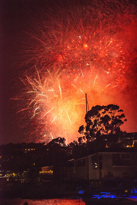
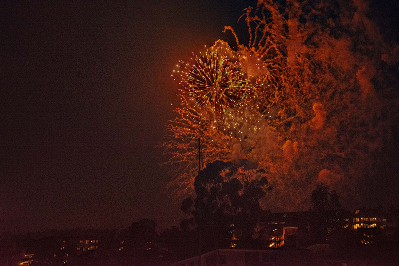
There are lots of photos of fireworks -- lots of people take them. But to me, most firework photos don't look like fireworks really look. The typical firework photo's taken with the camera shutter dragging (open a long time) and the result is pretty, but the pyrotechnics look like giant blossoms hanging peacefully in the sky. When I looked at my firework photos shot that way, I always asked myself, "Where's the action?. Where's the dramatic excitement as explosions reverberate in your chest? Why can't I 'smell' the distinctive acrid smoke that drifts over us?" It seemed that short of video, I should be able to create a still that has more sense of the real thing.
So, I created another way and these are some examples of the result. These are more like what I was going for, implying motion, bursting, explosion and haze. For any serious shooters reading this, I don't drag the shutter -- these were shot at ISO 5000, 1/250th of sec f5.0. But, even that doesn't look right as a single frame. Both images are composites of a series taken quickly -- click, click, click, click, click -- while locked down on a tripod. In Photoshop, I align and blend them (well, Photoshop blends them -- for these, autoblend works really well), then crop for the finals you see here. I'll leave it to you whether you like these better, the same or not at all, but at least they're a bit different.
The Eyes Have It
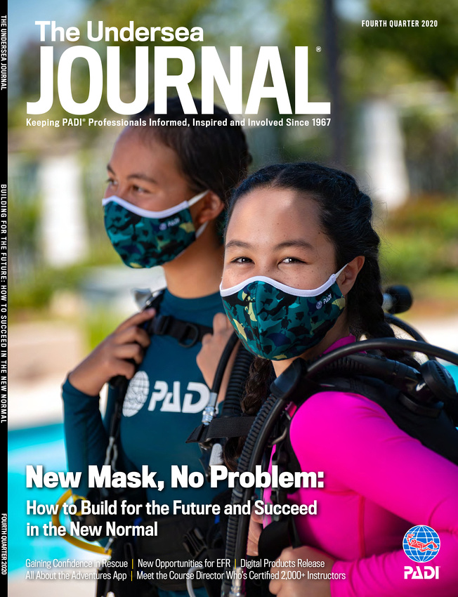
Ask people to describe a smile, and typically you hear about mouths – that the ends curve up, that a big grin shows teeth, etc. It's funny, though, because while that happens, that's not really where we smile – or show anger, grief, amusement or any other emotion. It's our eyes that tell others what we're feeling. It's how we can discern fake smiles from real, and teasing from genuine anger. Without words, our eyes reveal cowardice or confidence.
In this shot, the girls are unquestionably smiling real smiles. Forced grins would have been invisible, camouflaged (pun intended) by the masks, yet because we see their eyes, we're reminded that even amid COVID, we find ways and we find joys. We don't need to see their mouths to see their mirth in this moment. English novelist Samuel Richardson said, "Where words are restrained, the eyes often talk a great deal." In a still photo, words are entirely restrained, so eyes do all the talking.
Just a Cup of Coffee
The shot we needed was a steaming cup of coffee with a spoon. Someone might think, "Just pour a cup, snap a shot and be done," right?
Well, not if you want a good shot. If you want something better than the all-too-common amateur cellphone-snap-look, the lighting on the spoon, table, steam and cup have to differ a good bit. Lighting this in the studio requires multiple soft and hard lights, each with numerous flags, grids, snoots and gobos to control what gets lit and how. Then, you pour hot coffee to get the steam rising – again, and again and again . . . because steam and smoke can be shot well, but it takes time, patience and trial-and-error. A lot.
But, thanks to COVID, I couldn't do any of these this time. Home-officing it, I lacked access to my usual studio, as well as the Speedotron lights and modifiers I'd typically want. But thankfully, I only had one shot and had access to other lighting. Instead, I shot this in my living room using only two Godox strobes and a few modifiers.
If you know lighting, though, it looks like there are at least three soft lights and two hard lights. That's because this image is actually a composite of five shots, each lit separately for the spoon, table and cup, plus for fill and highlights. After shooting these separately, I combined them in Photoshop using just the part of each shot I needed to get the exact same look that I would have gotten in the studio using the Speedotrons etc.
If one were to think that now there's no need for the studio and other lights, surprisingly, they would be mistaken – for at least three reasons. First, you have to be able to do it as a single shot, or you won't know how to shoot it as a composite. Second, compositing like this is somewhat faster (not easier, btw) for one or two shots – but if you need more than that in the same lighting (common when shooting professionally), it's way faster to use the studio and set all the lights once. Third, compositing like this works only with still life and a locked down camera. Within reason, you can't shoot anything that moves this way.
Oh, what about the steam? I almost forgot.
No steam. I created it in Photoshop. In fact, I didn't even use coffee. Why waste a good cup of joe?
A Privilege
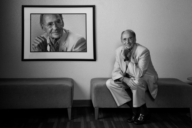
When I was asked to do a portrait for Ernie Brook's DEMA Reaching Out Award, I'll admit I was intimidated. While I'm pretty confident in my abilities as a shooter, he's, well, Ernie Brooks. The Ernie Brooks -- one of diving's most noted photographers. One of photography's most noted divers. The son of the founder of the famous Brooks Institute of Photography, and later, president of it for almost 30 years. That Ernie Brooks – one of my heroes when I was still figuring out which side of the camera to put the lens on in my late teens. He's forgotten more about photography than I know . . . now he's going to sit for me.
Needless to say, I (we, actually – thank you, Dawn, for everything you do to make me look good) wanted to make an image worthy of such a worthy image maker, at least as much as I could. I started with this: Have him pose with an old film era Nikon and well-worn Tussy housing my friend Budd has. It would be so . . . Cliché. Cliché. Cliché.
No way I'm doing cliché for this.
Until the day before, I didn't know where to go with this. But much as necessity is the mother of invention, desperation is the father of inspiration and when Ernie showed up to shoot, I (we, again) knew what we wanted. Then we shot. Photographing a photographer tends to be either very easy or very hard, and thankfully Ernie is very much the former. First shot to final took less than 10 minutes – a testament to Ernie's expertise because he knows what the camera likes.
Our concept evolved as we shot and later in post, but I'm pleased with the result. Actually, more than pleased. Shooting it was a privilege. And, I think it's one of my best.
Thank you, Ernie.
The Problem with Photoshop
No, this is not another rant about how Photoshop is a harbinger of the apocalypse and will be the end of life as we know it. I like Photoshop. I use it and (I'm told) I'm pretty good at using it for some heavy-duty photo manipulation and construction (like this one).
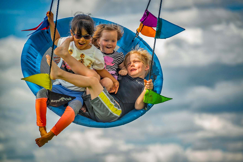
But, I've discovered, my ability with Photoshop comes with an annoying problem, and here's a typical example: When friends of mine saw this image, many (including skilled photographers) complimented me on how well I dropped the dramatic sky in behind the kids. Wow, that was very kind and I always appreciate compliments, but, uh . . . . that's the sky that was there. I didn't composite in a new one.
Yes, I did use Photoshop (along with high speed synch flash) to balance the sky's brightness with the swing's, and of course to generally adjust color, exposure, etc., etc., and that's why it's so dramatic. But there's no photo sleight-of-hand (tip of the hat – sans rabbit – to photographer/magician Scott Tokar there) going on. That said, I'll admit that it does look like the background was dropped in, mainly because it's not typical to get a sky's lighting to match the subject so well.
If I were to do this over, I'd be tempted to go the other way and let the sky be a bit overly bright and a bit flat (grayish), just so it looks like what you expect in a photo. It seems that even with new technology improving the brightness range we can capture, people still expect the old blown-out (i.e. too bright) sky of a "real" shot like this would have. I'd guess this is partly because we're not yet used to the latest photo capabilities, but also because of millions of snaps made daily that don't even attempt this kind of dynamic range. So, I'd be tempted . . . but nah, I'd do this way again.
The Camera as Art
There's no denying that the camera is one of the most important advances in imaging. As pointed out by painter and art blogger Jim Lane in 1999, along with paper and oil paints, the camera changed art forever (with the camera obscura well before the invention of film) by teaching us perspective and creating the illusion of depth in two dimensions.
But, have you ever considered the camera as art itself? Like the automobile, it is a beautiful technology with an evolution that reflects more than functional advancements. Over time, camera materials, colors and feels changed along fashion and aesthetic lines not only to make cameras more capable, but to match contemporary design trends. Check out this link that shows the evolution of Nikon alone – and other brands like Canon, Sony, Minolta etc. evolved similarly, each both following and leading to the beauty of photo technology in its own way.
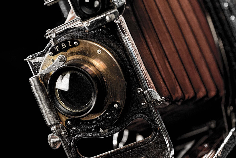
As an accidental camera collector (I didn't mean to start collecting cameras; it just kinda happened) as well as a shooter, I have cameras ranging from the rudimentary models of the late 19th century (my collection includes one of the first commercially available cameras) to the sleek, high-performance DSLRs we use today. Each has a story about who we were and who we are, not just as photographers and snap shooters, but as cultures and societies. To go with my displayed cameras, I shot this macro image of an early 1920s folding Kodak. This camera could never be created today, yet it has an elegance that modern cameras lack. Its brass, leather and steel remind us that we didn't always have plastic and aluminum (for better and worse). It reminds us that while technology and how we express beauty with design and imaging change, beauty itself endures. Contesting ContestsSo I entered another photo contest. Okay, okay, those of you who've heard me rail about contests hold off on the mouse click – this one was a good one. No, I didn't win. I didn't even place or get a mention – I don't care because I shouldn't have. Here's my entry:
The contest was to create a fictitious horror movie poster. It's an acceptable work (at least in my biased opinion), but I am glad it didn't fare better in the competition. Let me explain.
Rewind several years. I've never been big on photo contests, but I've entered them, primarily to stretch myself. One thing you learn is that judging may seem arbitrary, or it may be very balanced and impartial, the latter primarily with trained competition judges. The former are the ones I've come to avoid, but now and again, I still succumb and try anyway, hence this rant.
It's not always a surprise when contest placings don't make sense. Looking at the results of a local, small community contest at a fair (I didn't enter this one), there were a lot of amateur cliché snapshots along with some wonderful portraits and interactive scenics with dramatic lighting. The winner? A cliché sunflower snap, ironically hanging right next to a far-better shot with dynamic composition that showed a working rancher backlit through haze. Not only didn't it even get an honorable mention, it was likely best of show (IMO). Amateur judges = amateur placings, so no surprise here. But, in other contests, the judges are supposed to know better.
A few years ago, I entered this shot into a portrait contest sponsored by a major photo magazine:
It didn't win, place or mention. As the contest unfolded online, they showed all the entries and there were far better portraits, so I knew I was appropriately out of the running. But, then they posted the winner, and that ticked me off – it was a slightly glorified snapshot not even close to many, many way better images. Even my entry was better. I'm not sure what tainted the pool, but I no longer subscribe to the magazine.
Earlier this year, I entered this shot in an informal contest promoted by a prominent photo art vlogger who would judge. No prizes or anything – he just shows and discusses the ones he likes in his video blog. The contest challenge was to do something that illustrates the color "red."
This I upped for myself with this thinking: Most people will lean on the color, so can I illustrate the concept of "red" without using the color itself? My able assistant Headly posed for me as I juxtaposed the former Soviet Union flag over him, the concept being to characterize the bleak, dark impersonal nature of the Soviet system. The well-known flag would make "red" obvious even with the color itself missing.
Or not. As I watched the vlog with the posted results (which excluded mine, of course), every shot had the actual color red, with some (to my eyes) cliché and not particularly noteworthy. But, the vlogger's a heavyweight voice in the photo art community, so I'm not knocking this. What do I know about that world? Not much. So, I realized that my photography differs significantly, making my shot a big mismatch – or maybe it just doesn't work at all – so my bad either way. I no longer follow his vlog – not out of anger, but because it doesn't pertain much to what I do.
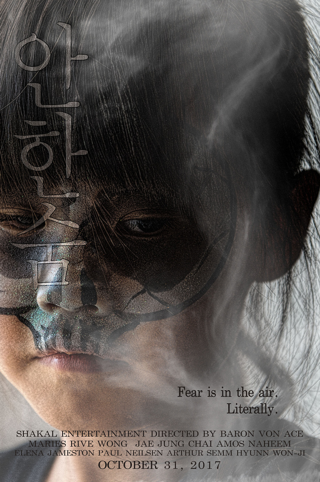
This brings us to the movie poster contest by phlearn.com. My entry didn't place or mention, but that's fine: 1. IMO, my poster isn't bad. I'm satisfied with it, but it's more of a thriller movie poster than a horror movie poster. (The title is, loosely, "Don't Breathe" in Korean, btw). 2. There were many, many entrants that fit "horror" better. 3. All the winners and mentions were excellent work. The judges chose well (click the link to see them) and while anyone can debate the rankings, I don't think anyone can say a clearly inferior work ranked inappropriately.
So, thank you, Phlearn, for a contest I don't contest, protest or detest.
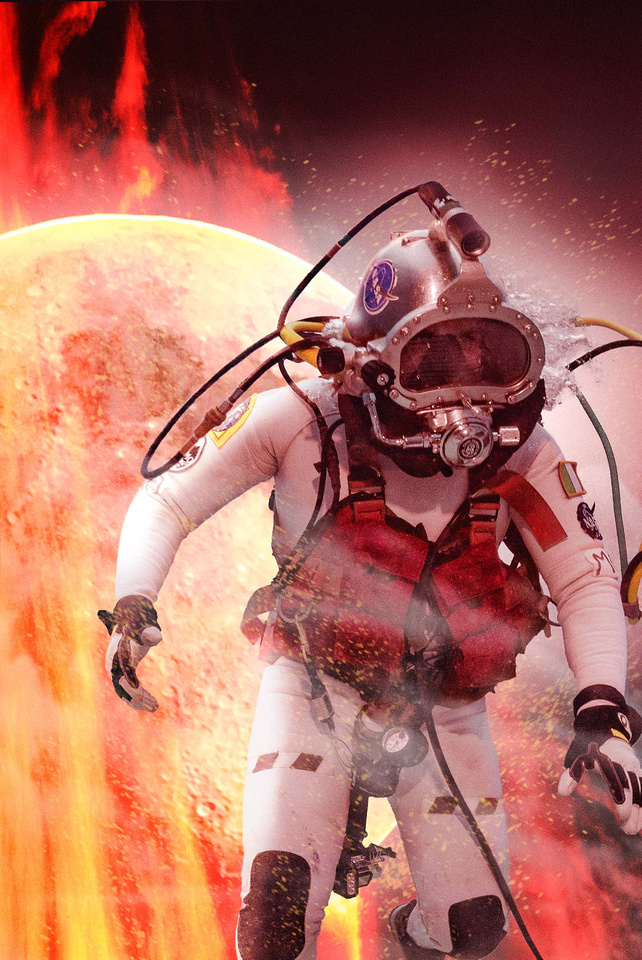
Action Hero in Action
As Dr. Marc O'Griofa, an aquanaut in the 2016 NEEMO 21 mission, conducted science on the seafloor, a frame I captured just screamed movie-style action hero poster to me. This wasn't something I'd been asked for as part of my mission support duties, but sometimes you get inspired and you just have to run with it.
We all know action hero posters when we see them -- like the Dark Knight, Ironman or Lara Croft. In fact, in almost any culture and even in a language you don't speak, you still know action hero posters. Even posters for movies that have action and heros, but aren't really "action hero" movies have the look -- like Gravity. So, what is this look that makes action hero posters obviously action hero posters? There are at least ten characteristics common in action hero posters. Master Photoshop artist Dom Quichotte identified eight in his FXray Superhero tutorial (with some of my elaboration): 1. The hero holds a weapon or a technical tool 2. Smoke, fog or clouds 3. Flying debris 4. Sparks 5. Edge lighting on the hero 6. Dark buildings or other dark structure in the background and/or foreground 7. Rain 8. Fire or explosion The last two, which Quichotte didn't mention (but are in his tutorial image) are: 9. Specialized clothing (e.g., superhero costume, technical/functional wear or other distinct wardrobe) 10. Hero either in action, giving defiant expression, or both
Most action hero posters don't have all of these, but they do have most of them, with defiance and/or action the one that seems universal. Click some of the links above: The Dark Knight has all but rain and holding something. Ironman has all but the buildings and the rain. Lara Croft is on the low side, but still has the weapon, edge light, specialized clothing and defiance, plus you could argue whether the ornate 3-D logo qualifies as dark structure, and the texture is similar to smoke. Gravity has more than Lara Croft: smoke, flying debris, edge lighting, dark foreground structure, explosion, specialized clothing and hero in action.
And that brings us to our action hero, Doctor Marc. No weapon or tool in hand (though clipped to his harness), but smoke and fog, sparks, edge lighting, fire, specialized clothing and he's clearly in action. Although I didn't manage the dark buildings, putting the moon behind him seemed a better fit anyway, considering he was doing research that will help us explore space. Although I did this just to stretch my creative legs, my action hero poster seemed well received by the NEEMO gang, and Marc seemed to get a kick out of it.
The real movie posters are, admittedly, better and more detailed, plus have the glamour, talent and stunning looks of Christian Bale, Robert Downey Jr., Angelina Jolie and Sandra Bullock. But, even with all that, my action hero poster has them all beat because it has the one thing they all lack (though Marc would try to deny it):
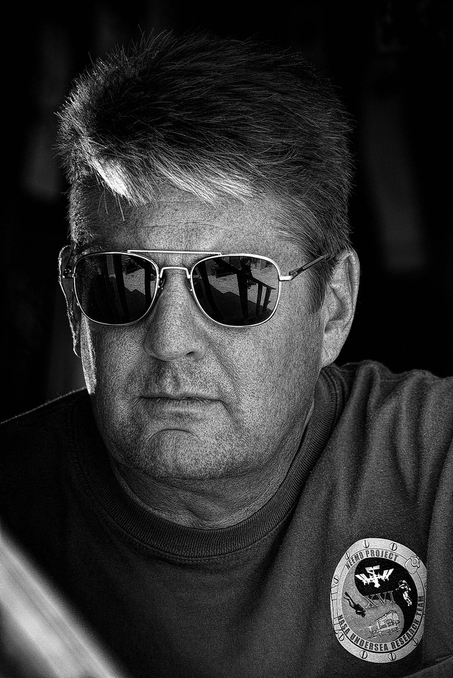
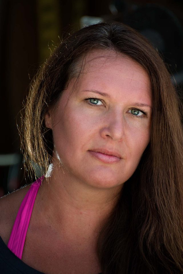
Two For OneWhile providing diver support and shooting for the NASA NEEMO XXII mission a couple weeks ago, my friend Dawn asked if I could spare a few moments to do a new portrait of her. Having shot her before and always glad I did (she's our generation's Maud Adams, Bond girl of the 1970s -- click here and you'll see what I mean. Dawn crewed NEEMO XXI so that's Dr. Dawn to you. ), I jumped at the chance. The camera loves her (even facing away -- check this out), so I wasn't going to let the opportunity to slip by.
But, there was a challenge. While I've recently been shooting a lot to help with NEEMO press coverage and in-house imagery, the majority of the work's underwater and I'm hauling dive gear, so I didn't have a lot of surface-side gear that I normally use for portraits on location. I didn't even get to bring Headly. But, being a pro shooter isn't about having everything you'd like to have at the moment you'd like to have it -- it's about knowing light then using what you've got to get the job done.
During a break in my duties, my solution (as it always is in these cases) was to find the light I needed and augment it with what I had (two speedlights). I kicked around the support facilities for FIU's Aquarius Reef Base, finally landing on some nice indirect sun just inside the door of a tool shed. But, before pulling Dawn away from what she was doing, I wanted some test shots. My friend Jason was wandering by and "volunteered" (minor arm twisting) to fill in for Headly. Although I hadn't set out to portrait Jason, even as we worked I knew I had something. After some light adjustments and post processing, we got this:
Wrapping from channeling Maverick and Top Gun, I called in Dawn. Since both sessions were going to be in the same basic light and setting, my wheels were already turning on how to make them differ. To start, their individual features lent themselves to different positions. Then, I adjusted the lights a bit, changed my angle and we started shooting We ended up with this, among others:
The final touches were in post. Jason's shot lent itself to stylized black and white with a gritty, heavy-detail look that works well on guys. Normally, I have people pull their shades so we can see emotion in their eyes, but the aviators make this shot. He looks like a man-of-action, which fits. Jason has a big heart that he backs with action.
Dawn's more likely to be smiling than not, and we while have some of her lights-the-room smiles, I love the intensity her serious-side projects in this one. It reminds you not to stumble over her beauty and overlook that she's one of the world's leading space/underwater scientists. Finishing her image was the classic handling fitting of a lady (as well as a chance to do better; I was way heavy-handed with my last portrait of her). The result is something I like, but, I don't think I'll compare her to Maud Adams any more.
It's not fair to Maud Adams.
|