|
Welcome to my online column. It's a few notes on what happens on different photo shoots and thoughts about shooting and image processing that may be useful to you if you're looking for my services as a photographic artist, or if you're a fellow shooter/image maker who works in the same areas in which I do. Reviving the Golden Age
Sorry for such a long interval between posts. We just moved and as you may expect, that has kept me really tied up.
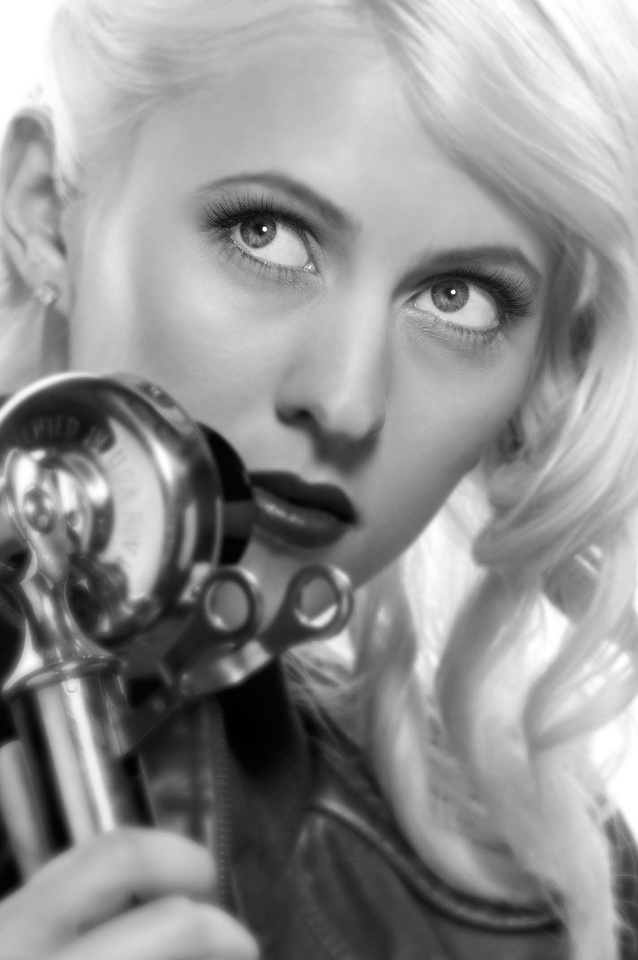
Some of my favorite looks are from the late 1930s to late 1950s era in Hollywood. This was the period when photographers including George Hurrell, William Walling Jr., E.R. Richee and C.S. Bull created many of the iconic movie star images that today we recognize at a glance. Photography evolved over this 20 year period, so that there are some notable differences between images created early and those created late in this span, but most images from this era share several characteristics. First, they are almost all in black and white. Second, they have very shallow focus range. Third, they used hard light -- that is, lights that create shadows with a relatively hard, distinct edge as opposed to a wide, gradual edge. Although these resulted from technical limitations, the style became so distinct that it continued longer after technology had moved on and the limitations no longer applied. George Hurrell continued to shoot using largely the same equipment and techniques until right before he passed in 1992. For this image, we created a then-is-now look using modern equipment. I modified the lights to replicate the hard look, and in Photoshop, converted to black and white. The image had a wide focus depth, but I recreated the narrow look of the period in Photoshop as well (which takes more work than it may appear). The makeup artist imitated the period while keeping a modern feel, and a candlestick phone added a touch that takes us back (even though it is more of a 1930s thing than '40s). I've used this look for portraits as well as fashion. Recently, I used it for a subject being recognized for bringing the movie industry to his area many times (away from Hollywood, on location), making this classic look fitting. It's a fun, rewarding imaging style for both me and the subject.
Wish We Were There
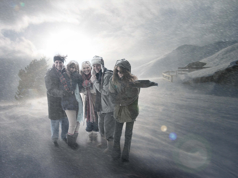
For this image for the client's Christmas card, one option was to fly to the Yukon and hang out in a cabin on the side of mountain until the weather turned nasty. For various reasons – not the least of which included my distinct dislike for temperatures below 65ºF – that was out of the question. The only real choice was to create it in the studio and computer. We shot the family in two sessions, lit so it would composite over an image selected by the client, and purchased from iStock. I've been asked how we made the wind look so real.
Okay, here's the trade secret: To make wind look real, use (ready for this?) . . . WIND. We had a powerful shop fan and blasted the talent with it.
The result, instant familysicle. The look we wanted wasn't "wish you were here." It was "be glad you're not here," and I think we accomplished it.
Counting Lights
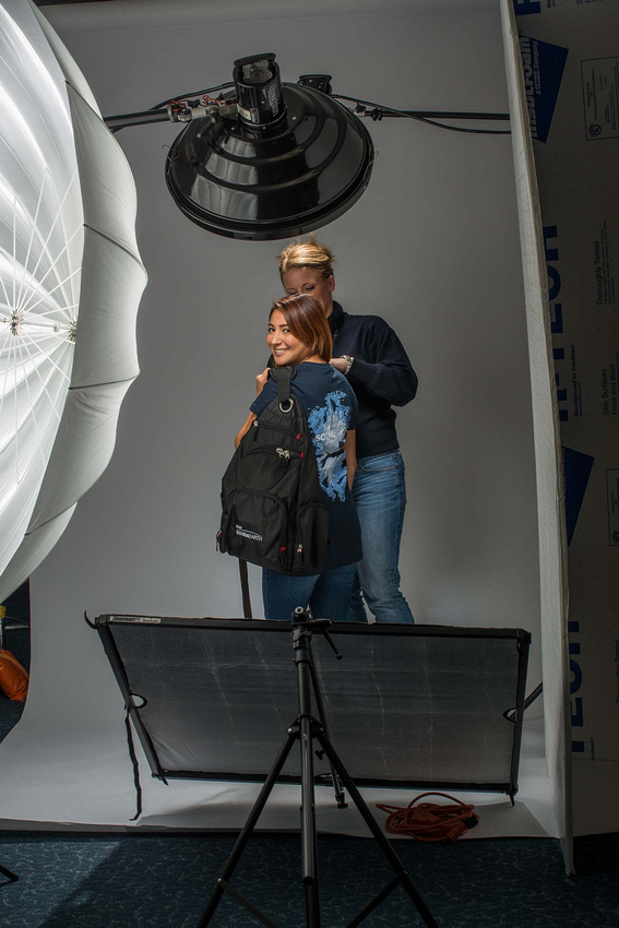
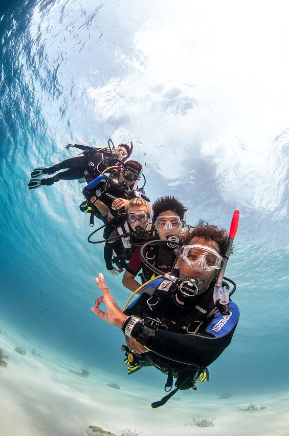
Pop quiz: How many lights did we use to create this image of ScubaEarth.com fashion wear? Two? Try again.
Three? More.
Four? Getting warm
Five? Not quite.
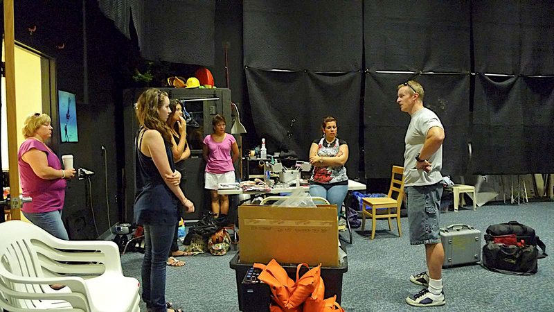
The answer is six lights. If you're not familiar with studio fashion imaging, you may be surprised that such a simple shot (it should look simple) takes so many lights. It's not a matter of brightness, but a matter of shape. When we're imaging, we use lights as chisels that carve the illusion of three dimensions from a two dimensional photo. Each light does a different job in what you hear called "lighting," but which is actually just as much shadowing. Here's a behind the scenes shot:
Looking at this, there are six, but only five are visible. First, hidden by the model (and my PA Niccole in this shot) is a strobe head you can't see, but if you shoot, you should be able to tell it's there because it illuminates the backdrop. Then, there is a strobe shooting through the umbrella on frame left, another strobe head with the beauty dish (light with big round reflector at top of frame), and a strobe hair light that you can see just behind the beauty dish. That's four. The last two lights are the big silver reflector below the model angled up at her, and the V-flat on frame right.
At this point, some may be screaming that reflectors are reflectors, not lights. Without getting into an argument with Webster, no, from a photographic point of view, reflectors are lights just as much as strobes are. Whether it is a strobe, reflector, a wall, ceiling, someone in a white dress or whatever, photographically, anything that sends enough light towards the subject to be visible in the captured image must be treated as a light that is subject to all the principles of lighting (inverse square law, family of angles, hardness proportional to two-dimensional relative size, etc.)
Failure to think in these terms commonly cause problems lighting and learning to light. Photographers sometimes decide that something is or is not a light based on whether it emits photons instead of whether it changes the light falling on, and reflecting from, the subject. Or, they only consider something a light if they placed it to light the subject. Either is a mistake because it neglects the fact that light is light, even if it's a stray reflection off a broken Coke bottle 20 feet out of frame, and therefore affects the shot. A professional photographer or photographic artist doesn't neglect this because you can't get reliable results any other way.
If you hear someone say "I didn't use any lights for this shot," it's only true if the person then shows you a black rectangle. Otherwise, the person either doesn't understand, photographically speaking, what a light is, or the person doesn't know how to count.
Sometimes You Need a Stupid Model
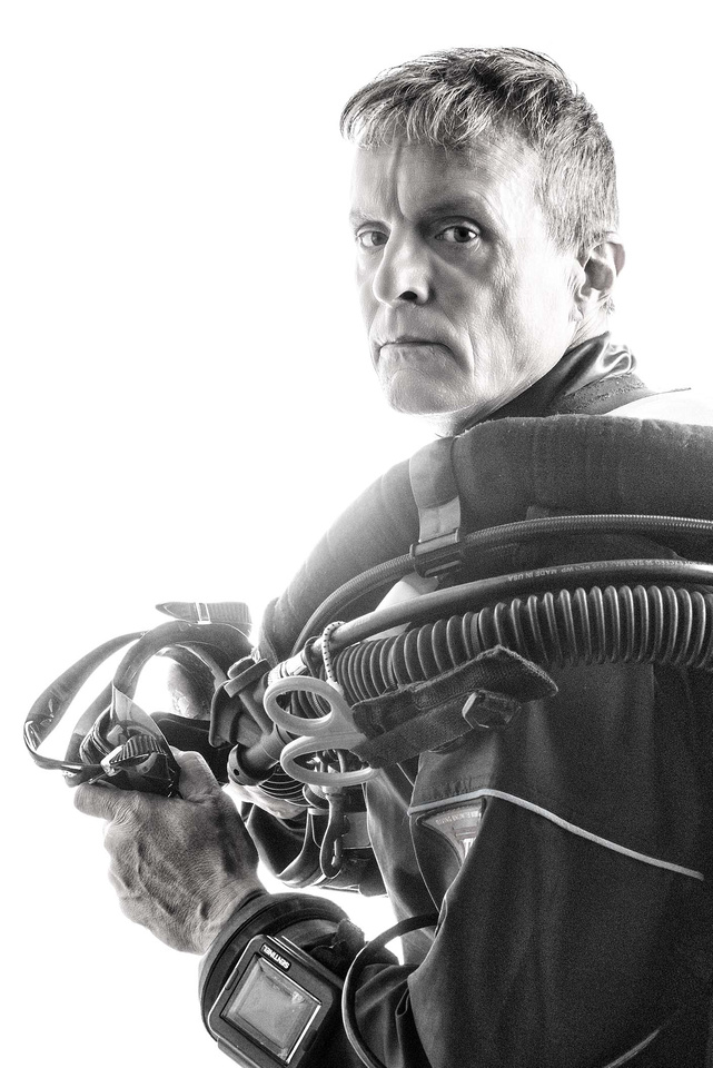
Since I have a keen interest in dramatic portraits, I'm always exploring new techniques for creating them. In particular, I'm always looking for new ways to show character, which is often a euphemism for not flattering (in dramatic portraiture, you commonly hear that everyone except the subject loves the result). So, to try some new approaches to this, I needed a model who already knows he's not exactly eye-candy. That way, my dramatic, facial-lines-enhancing, age-exaggerating image hopefully wouldn't insult him .
Another part of my purpose was to gain experience with some new lighting equipment. To this end, I decided to play with high key lighting (that means bright background, diffuse with almost-but-not-quite blown out highlights, and often, reduced overall contrast). For more character depth (no pun intended) I wanted to shoot a technical diver because you don't see many high key shots of tec divers. So to pull this off, my model would also have to be someone willing to tolerate sweltering out a quart of sweat while standing around in 80 pounds of scuba kit and a hot dry suit for the 45 minutes I needed for the shot.
Dilemma: Where could I find a tec diver model who is this ugly and who lacks the mental capacity to refuse?
Eureka!
It's a self portrait.
My wife says it makes me look 10 years older and not one bit handsomer or smarter.
Success!
The Purity of Black and White
The first photographic image was black and white. Everyone -- pros and snapshooters -- shot primarily black and white for photography's first 100 years, even after the invention of "mass" color imaging (Kodachrome) in the 1930s. Black and white died almost over night in snapshooting when color film and processing cost the same as black and white (eventually, color was actually cheaper). But, among serious imagers, black and white stayed popular. This was partly driven by the ability to further refine exposure, control contrast and selectively "burn" and "dodge" prints in the darkroom (you could do it in a color darkroom, albeit not as easily).
Today in the digital age, black and white has zero advantage over color with respect to cost or to post processing. Yet, black and white remains. It's common in portraiture, and very common in fine art imaging. Editorial fashion uses it, too.
I suppose every artist has a different opinion as to why black and white survives, and perhaps they're all correct. I think it's because when you look at a black and white image, color doesn't distract from the shapes, textures and gray shades. This heightens drama, and we infer feelings that differ from what we would infer from the same image in color. Add a hue to black and white, and it stamps its full emotional weight without competition.
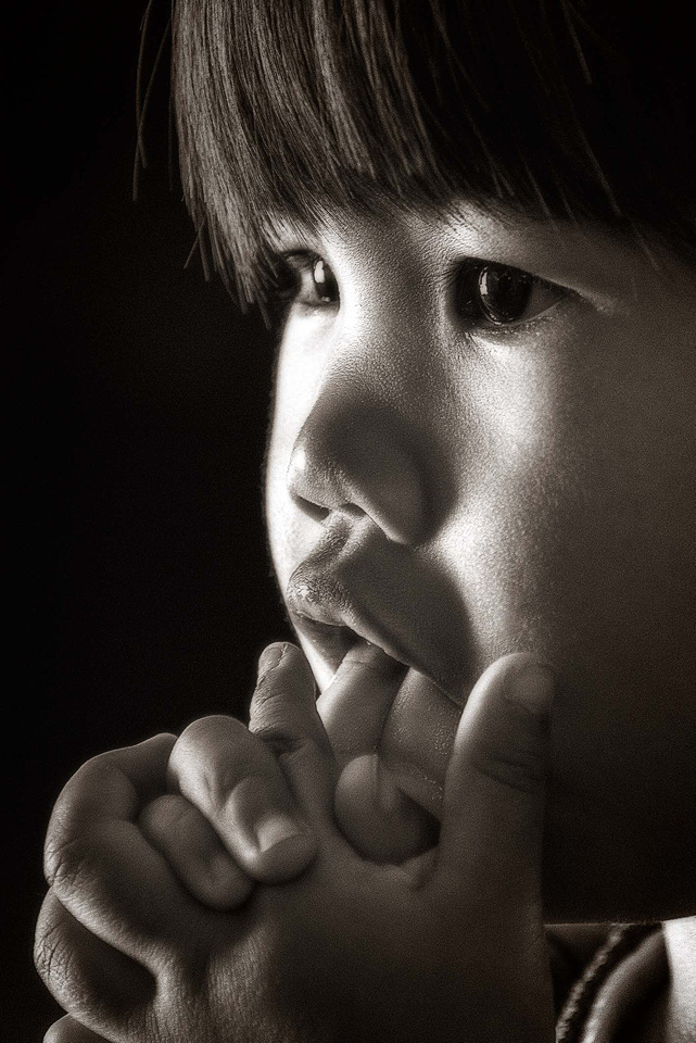
In this shot of my daughter, black and white separates her. It shows her alone in her thoughts. We feel her isolation, but that's not the whole story. The warmth of a very gentle sepia restores an intimacy lost in cold whites and grays. We feel her alone only in her thoughts -- not alone in the world.
The same image in color doesn't feel the same way at all. It doesn't feel right. It's little more than a mildly interesting snapshot. It doesn't work.
Black and white is pure. That's why sometimes, it is more vibrant than color.
A Short Photographic Translation Guidebook
As a photographic artist, I’m guilty of what many professionals do when you interact with them: I use “photo slang” and technical terms that aren’t always clear to those outside our vocation. That’s not friendly or service-oriented, and if I’ve done that with you, please accept my apologies. It’s not conscious – everyone in imaging-making tends to do it because “insiders” share a common language. I’m betting you do the same when conversing with others involved in your vocations and avocations.
But, apologies don’t solve anything. So, for those who contract or work with image makers, or if you’re new to the field, here’s a short conversational guide to common expressions, and what they mean, divided into two categories.
Image Quality and Retouching “These images have a light, dreamy quality.” means “These images are slightly out of focus.”
“I used dark, low-key exposure [or “bright, high-key exposure] to enhance the mood.” means “I don’t know how to use a light meter.”
“Loss of skin detail is normal when finishing this type of image.” means “The retoucher doesn’t know how to retouch skin.”
“We retouch just enough to reveal a subject’s true beauty.” means “We make everyone look at least ten years younger.”
“You’ll love these – and I barely had to retouch anything.” means “One hour each in Photoshop.”
“You’ll love these – and I only had to do basic retouching.” means “Three hours each in Photoshop.”
“You’ll love these, but I had to do a bit more than usual in Photoshop.” means (to female subject)) “I composited Jennifer Aniston’s face onto yours.”
“Among the hundreds of images we shot, I narrowed it down to these top 20.” means “My hard drive crashed without a backup, but I recovered 20.”
Production “Ideally, let's start with a call time of 7 a.m.” means “We start charging you at 7 a.m., whether you’re there or not.”
“Secure that stinger near craft services with some C-47s while I calculate the depth of field.” means “Keep people from tripping on that extension cord next to the refreshments with some clothes pins while I make sure the image is sharp, but don’t say it that way or the client may think he can do this stuff himself.”
“The model has perfect skin, so we don’t need a makeup artist.” means “The budget was so low something had to go, so no makeup artist. And, there’s no craft services either.”
(To another photographer): “I’d love to have your help on set.” means “You can be my VAL (Voice Activated Light stand),” i.e., “I figure you have a general idea of which way to point a light you’re holding.”
(To a photo intern): “I’d love to have your help on set.” means “You can be my HLS (Human Light Stand),” i.e., “I will point the light and you will hold it.”
(To a model’s unemployed boyfriend who came along to “help.”): “I’d love to have your help on set.” means “You can be my HSB (Human Sand Bag),” i.e. “Sit in that chair and make sure it doesn’t blow away.”
Hanging Out with Two-Year-Olds
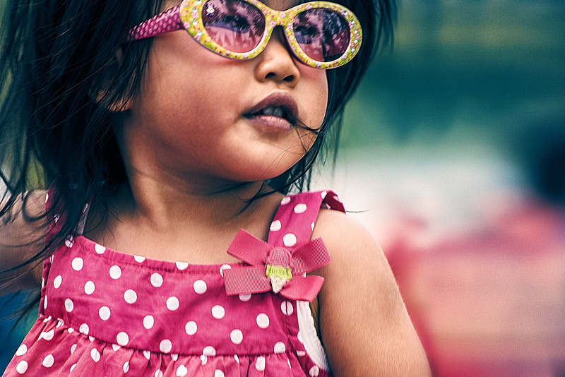
If you look at most of my imagery, you'll notice this shot (of my favorite model – my daughter) differs from my usual style. It doesn't have the crisp, concise imagery that I normally go for; it's soft. When I use pastels, normally I have something that stands out as brighter, or in a primary color; this one is entirely in muted hues. It took me two hours after-camera by the time all was said and done, and I expect that a lot of people won't even like it (art is subjective). I like it, but I trashed many shots working along this path. Normally, in a couple hours I can retouch and finish a lot more than one image (unless they're special composites, but that's another issue).
So, why bother? Because you can't grow as an artist unless you do something different from what you always do – unless you challenge yourself. You may fail to create anything newly wonderful (trust me), but you will always succeed in that you will learn something. Taking this on, I decided to think differently about my shots. The self-assignment was to work images I would normally trash, provided they had something I liked going for them. This shot is way too blurred for my normal tastes (two-year-olds don't hold still, unless they're asleep) , but I liked my daughter's expression. Also, it didn't have a background that fit the shot well. By working with textures, sharpening, midrange contrast, visual noise and complementary colors (introduced into the low and mid, and mid and high tones, respectively), I think I overcame this, but in any case, I came up with something that for me, is new and different.
In a few weeks, I'll look back with fresh eyes and decide whether I created something worthwhile. If so, I'll probably continue to see what I can learn by working in this direction. If not, it was still worthwhile, because now I know.
Some of the best advice I ever heard applies to many things, but especially to being creative: "Think left and think right and think low and think high. Oh, the thinks you can think up if only you try!"
That's Dr. Seuss. Maybe we should hang out with two-year-olds more often.
Perspiration and Inspiration
Sometimes people ask me where I get the ideas for some of the images I get to create (with the help of many, many talented people who work with me). My answer is sometimes we have to sweat out a concept, and sometimes a wonderful idea springs from the warped recesses of my mind, or the less warped recesses of someone else's mind.
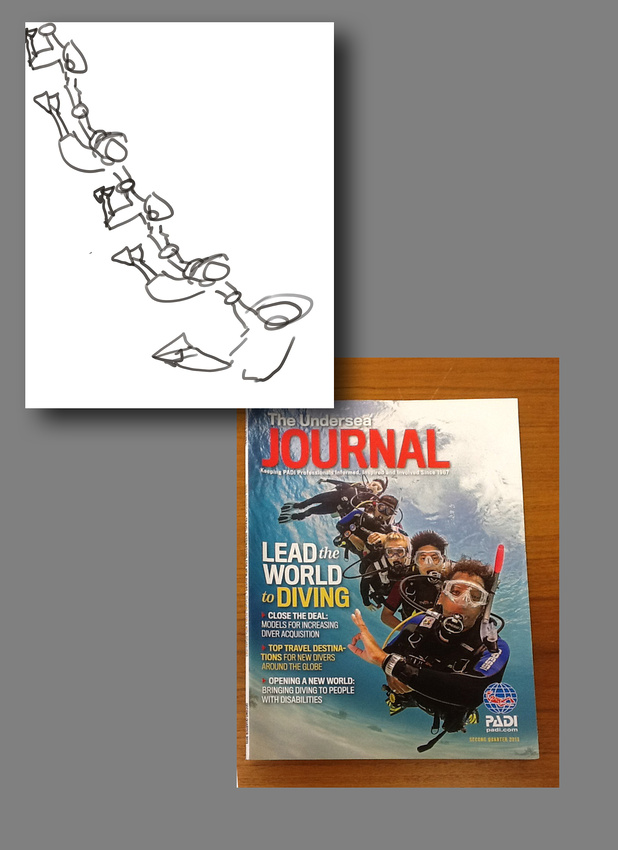
The image above is an example of the first. Some of the professionals I work with on The Undersea Journal -- Theresa, Aja, and Todd -- and I were kicking around ways to show how PADI professionals lead people into scuba diving. We thrashed around one bad idea after another for at least an hour, until someone suggested that we be literal -- show someone leading divers, single file. I sketched out the concept (below -- and now you know why I shoot instead of draw) and suggested we shoot it almost vertical (which we did). The result was the image above, and the cover below.
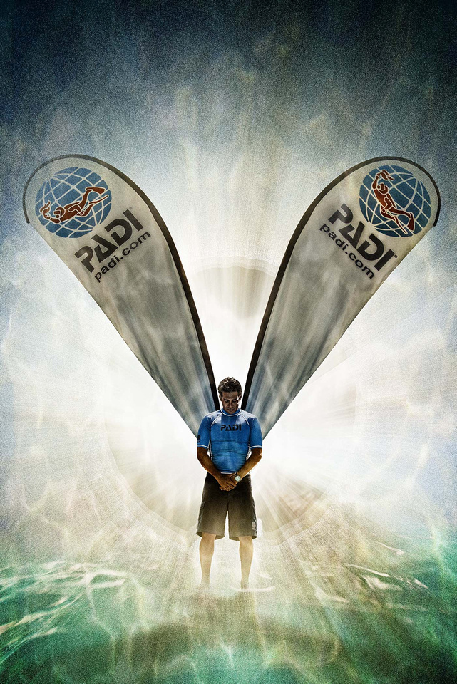
The PADI "Angel" shot was the result of an idea popping to mind. We working on another project and it occurred to me that some of the banners we were using look like angel wings. During a break from the "real" work, my friends Mike, Abe and Hernan willingly delayed hard-earned breathers to execute the idea. This BTS (Behind The Scenes) shot shows the basic setup:
Here's the point: Whether "the" idea results from hours of beating our heads against the wall, or simply a flash of insight, bringing the concept to the computer screen (or to print or wherever it's going) takes work. These images weren't snapshots that got banged off in a moment. They took patience, teamwork, lighting and multiple exposures to get the needed capture, followed by hours (cover shot) retouching, and then even more hours (angel shot) crafting the final conception.
If you create a remarkable image, you may or may not have inspiration. But excepting a few lucky shots now and again, you will always have perspiration.
Think You Have What It Takes?
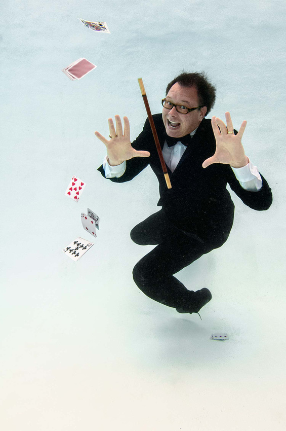
One of the most frequent requests I get is to shoot underwater models and portraits who are not scuba divers -- like this one of professional magician Scott Tokar. To get this shot, we were 12 feet deep and he's fully dressed, holding his breath. Besides me, there are two underwater photo assistants supporting (check out this behind scenes image). These types of underwater portraits and fashion are harder than they look for the subject/model. There's a lot more to it than sinking to the bottom of a pool for a moment while I snap-snap-snap. Forty years ago, underwater photos impressed people just because they were underwater. Today, even snapshooters take cameras underwater, so it's not enough if you want a striking image. Someone who can't pose effectively doesn't give me anything to work with, and that's the start point in imaging. Scott, who is both a professional photographer and experienced PADI Rescue Diver, shows what it takes:
1. Comfort in water. You have be to be completely and relaxed with your ability to hold your breath, swim and work in water. Being a scuba diver is helpful, but not necessary (I have photographed many talented models who were not divers). Scott can easily hold his breath and pose for 30 seconds, which doesn't include the time to get to the pose and to return to the surface or a scuba air supply to breathe. Notice that his mouth is open? He's not freaked out by letting water in it.
2. Eyes open. Scott's eyes are not only open, but they are wide open and they look just like they do if he weren't underwater. Many people squint or don't open them at all -- just doesn't work for imaging.
3. Playing to camera. Scott's cheeks aren't puffed out and he's playing to camera. He's expressive, giving us something interesting to see. He's using appropriate props and wardrobe. These are especially critical for this type imaging because the bottom of a pool is sterile and boring -- it's all him or we don't have anything worth looking at.
4. Using the environment. Scott's feet are off the bottom, with his wand and cards suspended in the water. There's no point in going underwater and then creating an image that doesn't differ from what you could take on dry land. Scott uses the water to give me a portrait that would take a lot of planning and Photoshop work out of the water.
Think you have what it takes? If so, let's give it a go.
|